Centrue
Card Ordering Experience
The Challenge
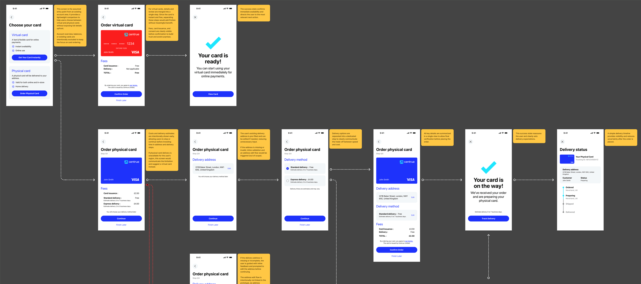
As a subsidiary of the established The Kingdom Bank, Centrue needed a modern card ordering flow that resonated with a digital-native audience while maintaining the core bank’s sense of security. The primary challenge was to transform a potentially tedious financial process into a seamless, trust-building experience by simplifying complex banking procedures.
The Goal
- Design a high-conversion mobile interface for ordering virtual and physical cards.
- Balance The Kingdom Bank’s corporate reliability with Centrue’s agile fintech identity.
- Minimise user friction during sensitive steps such as address verification and fee breakdowns.
My Role
As the Senior Product Designer, I owned the end-to-end design process:
- UX Strategy & Strategic Rationale.
- Low-fidelity Ideation & Wireframing.
- Design System & Component Architecture.
- High-fidelity Prototyping (Light & Dark modes).
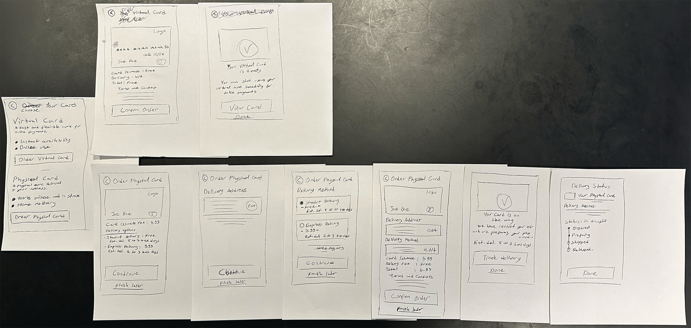
Discovery & Research
The card ordering process was designed not just as a series of forms, but as a trust-building journey. To ensure focus, the scope intentionally excluded KYC and wallet management to prioritise a fast, transparent, and frictionless card acquisition flow.
- Entry Point Clarity: I provided a high-level comparison between virtual and physical cards using short benefit statements, helping users decide quickly without being overwhelmed by details.
- Deferred Information: To reduce initial uncertainty and cognitive load, deeper technical information was intentionally deferred to later steps in the flow.
- Radical Transparency: Based on my research, I decided to surface fees and delivery estimates at the earliest possible stage to eliminate “checkout surprises” and build long-term trust.
🎨 Design Process
1. Wireframes & Low-Fi Ideation
I started with hand-drawn sketches to map out the user journey. This allowed for rapid iteration on the information architecture and edge-case handling before committing to visual details.
- Focus: Ensuring the “Finish Later” option was accessible at every step to reduce drop-off rates during the more complex physical card flow.
2. Visual Design & System Logic
To ensure consistency across the application, I developed a refined mini-component set based on The Kingdom Bank’s brand DNA, optimized for mobile-first interactions and accessibility.
- Consistency: Every UI element (buttons, text styles, icons) was designed with scalability in mind, ensuring a seamless transition from Light to Dark mode.
- Affordance: Distinct visual hierarchies were established for primary actions (CTAs) and secondary options to guide the user intuitively.
3. Final Flows (The “Frictionless” Experience)
The final output features a sleek interface designed for both Light and Dark environments, focusing on two distinct user paths:
- Virtual Card Flow (Instant Gratification): Optimized for speed. I merged ‘card details’ and ‘review’ steps into a single screen, allowing users to activate and use their card in just two steps.
- Physical Card Flow (Trust-Oriented): A structured process that builds trust through address confirmation and delivery tracking. Delivery methods (Standard vs. Express) are separated to clearly communicate the trade-off between cost and speed.
- Edge Case Mastery: Instead of showing disruptive error pages, I implemented inline guidance for missing addresses or regional limitations, redirecting users to virtual card alternatives when necessary.
📊 Results & Impact
✅ Reduced Drop-off: By surfacing fees early and simplifying the virtual card flow, the design minimises user exit points.
✅ Trust Building: Clear success states and a dedicated “Delivery Status” screen provide real-time updates, reducing uncertainty after the order is placed.
✅ Operational Efficiency: Inline error handling reduces the need for customer support inquiries related to address or delivery issues.
🧠 Reflections & Learnings
This project reinforced the importance of balancing speed with transparency in fintech. By treating “Edge Cases” as part of the core experience rather than afterthoughts, I was able to create a flow that feels supportive rather than restrictive.
- Key Learning: Designing for both themes (Light/Dark) from the start ensures that accessibility is baked into the product’s DNA, maintaining the prestige of The Kingdom Bank across all platforms.