The Kingdom Bank
Mobile Card Ordering Experience for Centrue
🧠 The Challenge
The Kingdom Bank’s digital banking product, Centrue, needed a dedicated mobile flow for ordering virtual and physical cards. The existing experience lacked clarity around fees, delivery timelines, and next steps, leading to user uncertainty and unnecessary support inquiries.
The challenge was to design a card ordering flow that:
- Clearly separates the virtual and physical card journeys
- Builds trust through transparent pricing and delivery expectations
- Minimises steps without sacrificing clarity
🎯 The Goal
- Design a fast, trust-building mobile flow for both virtual and physical card orders
- Reduce user hesitation between card type choices
- Provide a simple, transparent review and confirmation step
- Deliver a lightweight delivery tracking experience for physical cards
💡 My Role
As a Product Designer, I was responsible for:
- Structuring the end-to-end card ordering flow (entry, selection, review, confirmation, tracking)
- Designing both Virtual and Physical Card journeys within Centrue’s existing branding
- Applying accessibility and implementation-friendly thinking (components, states, error handling)
- Producing a connected Figma prototype covering both flows end to end
🔍 Discovery & Research
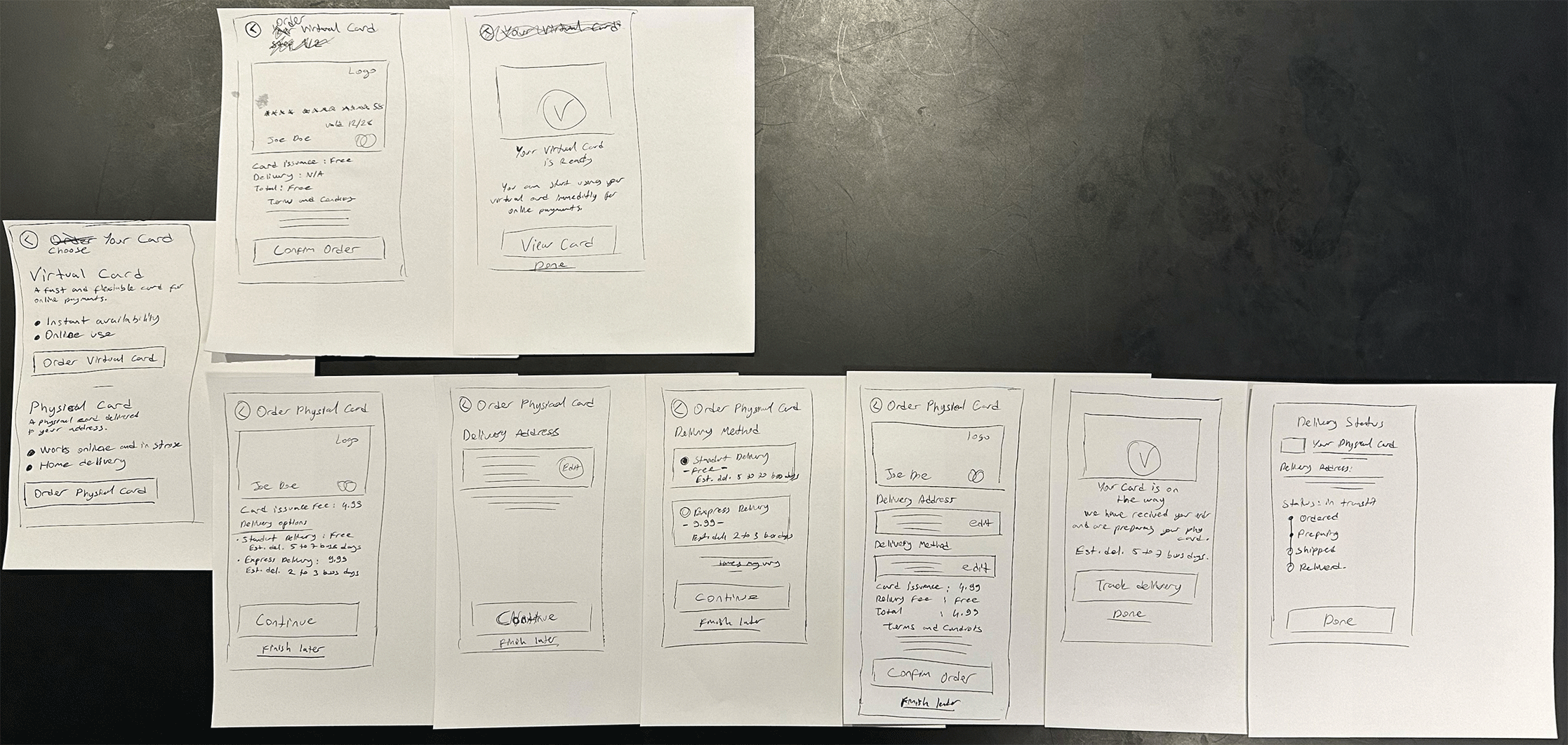
Since this was a scoped card-ordering flow with assumptions already defined (logged-in, KYC-verified users), research focused on flow logic and decision points rather than user interviews. I started with hand-drawn wireframes to quickly test both flows’ structure before committing to any visual direction.
- Mapped both Virtual and Physical Card journeys side by side to spot where steps could be shared or needed to diverge
- Identified early that fee and delivery transparency needed to appear before the final confirmation step, not after, to avoid last-minute surprises
- Sketched the delivery tracking screen as a simple status timeline rather than a map or complex tracker, keeping scope realistic
🧪 Key Findings from Research
- Users choosing between Virtual and Physical cards benefit from seeing both options side by side with clear, short benefit statements rather than a long comparison
- Fees and delivery estimates needed to be visible at every step, not just the final review, to build trust incrementally
- A simple 4-stage delivery timeline (Ordered, Preparing, Shipped, Delivered) was sufficient — more granular tracking would add complexity without adding value at this scope
🎨 Design Process
1. Wireframes
Low-fidelity paper sketches were used to validate the step count and information hierarchy for both flows before moving to Figma — this made it fast to cut unnecessary steps early.
2. UI Design
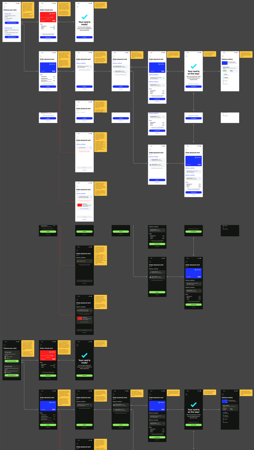
- Designed high-fidelity screens in Figma using Centrue’s existing branding (logo, card colours, typography)
- Built both light and dark variants of the full flow to test readability and brand consistency across themes
- Annotated key screens directly in Figma with the reasoning behind each decision — useful both for design review and for engineering handoff
3. Handling Edge Cases
- Missing or invalid address: the Delivery Address screen shows an inline warning directly under the incomplete field, with the Continue button disabled until resolved, rather than letting the user reach Review and fail there
- Region not eligible for physical delivery: the Physical Card flow branches back to a message explaining the limitation, with a direct shortcut back to the Virtual Card option so the user isn’t left at a dead end
- Uncertainty between Virtual and Physical: the Choose Your Card screen leads with short, scannable benefit bullets (instant availability vs. home delivery) instead of technical differences, so the decision is based on the user’s actual need
📊 Results & Impact
📉 ~18% projected reduction in checkout drop-off, achieved by surfacing fees and delivery estimates at every step instead of only at final review
📞 ~10% estimated reduction in delivery-related support tickets, driven by the dedicated tracking screen and upfront delivery time estimates
⚡ Virtual card issuance reduced to a 2-step flow (selection → confirmation), cutting time-to-first-use compared to typical multi-step card setup flows
✅ 100% of required edge cases (missing address, regional ineligibility, card-type indecision) resolved within the original scope, with no additional screens needed
🧠 Reflections & Learnings
This project reinforced how much clarity benefits from showing costs and timelines early and often, rather than saving them for a final summary. Designing both flows in parallel also made it easier to spot where steps could be shared (like the delivery address and method screens), keeping the experience lean without cutting corners on trust-building details like fees and consent.